“Data Is Beautiful”: 40 Charts That Might Change Your Perspective On Things (New Pics)
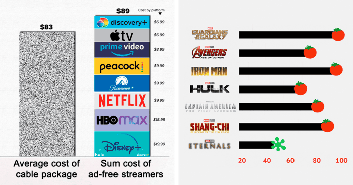
The subreddit r/dataisbeautiful truly lives up to its name. From global or internet trends to societal issues, this community covers it all in easy-to-understand visualizations that effectively convey otherwise complex information. Each graph, chart, or map has the potential to uncover patterns, expose correlations, or shed light on various topics. No wonder why as of … Read more